Home / Type Design / Page 8

Echoes from the Middle Ages

From the Renaissance up to the present day medieval letterforms, Romanesque and Gothic, have inspired type designers – much more than we think. An overview of revivals and type designs inspired by medieval letterforms, from 1400 to 2014. Presentation given by Gerard Unger to ATypI Barcelona 2014
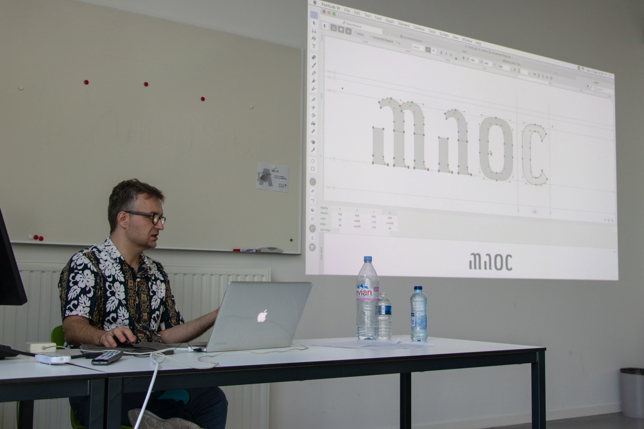
Inline vs outline

Jo de Baerdemaeker investigates the roots of manufacturing inline typefaces and illustrates the reasoning of their development through the typographic analysis of ornamented types. From the 2013 ATypI conference in Amsterdam. Inline vs outline’ investigates the roots of manufacturing inline typefaces and illustrates the reasoning of their development through the typographic analysis of ornamented types.… Continue reading Inline vs outline

Lost and found

Adi Stern about the case of Hebrew typeface design during the 1950s. From the 2013 ATypI conference in Amsterdam. The form of the Hebrew letter was radically changed during the first decade of the Israeli state. During four years, between 1954-1958, five new Hebrew typefaces were released in Jerusalem. Three of them irreversibly changed the… Continue reading Lost and found

Ala has a pen

Verena Gerlach outlines the results of the type design workshop »Ala has a pen / Ala ma pióro«, which took place at the Academy of Fine Arts in Kotowice, Poland. From the 2013 ATypI conference in Amsterdam. NOTE This video is missing 2 minutes at the beginning. Between February and November 2012, the type design… Continue reading Ala has a pen

Designing with science

In this presentation, Matthew Carter and Kevin Larson discuss what letter recognition tests might uncover and how those results could be used in practice. From the ATypI 2013 conference in Amsterdam. Reading psychologists have shown that we recognize words by first recognizing individual letters, then using the letters to build up a word. This implies… Continue reading Designing with science

New Transport

Updating, expanding and refining the UK Transport alphabet dating back to 1957, by Henrik Kubel. From the 2013 ATypI conference in Amsterdam. I would like to talk about my collaboration with Margaret Calvert in regard to New Transport. I have since 2010 worked in close collaboration with Margaret on updating, expanding and refining this seminal… Continue reading New Transport

Alverata: Present-day European letters with roots in the Middle Ages

Presentation given by Gerard Unger to ATypI Amsterdam 2013 on 11 October 2013 In Alverata elements from the Romanesque period (1000–1200) are comined with influences from 20th century modernism and modern classicism, as well as from recent developments in communication. Romanesque capitals in inscriptions were used for 200 years in a large part of Europe,… Continue reading Alverata: Present-day European letters with roots in the Middle Ages

Don’t design web fonts

Presentation given by Cyrus Highsmith & David Jonathan Ross to ATypI in Amsterdam on 11 October 2013 Here’s the trick to designing web fonts: don’t do it. The successful type series of the future will be the ones that can move between media. A web font is just one variation within a larger series that… Continue reading Don’t design web fonts