The conference was held at the Harpa Concert Hall, 14 to 18 September 2011. The local organizing team was led by Gunnar Vilhjálmsson and Hörðu Lárusson, and the conference was supported by the Association of Icelandic Graphic Designers, the Icelandic Academy of the Arts, and the Icelandic Design Center.
If you have more information and resources about the conference — photos, videos, reviews, slides, memories and more — please get in touch with us. We’d love to improve this page with as many resources as possible.
The conference will begin with 2 days of seminars and workshops. The first day, Wednesday 14 September, features two tracks of practical workshops on calligraphy, lettering and typeface design. The second day, Thursday 15 September, has two tracks of seminars and panel discussions featuring the latest developments in type technology, tablet typography, education and web fonts. The evening of Thursday 15 September and the following 3 days will feature a single track of presentations, opening with a must-see keynote presentation presented by Gunnlaugur SE Briem.
The conference this year is themed around the letterform ð (eth).The origin of the letterform ð (eth) can be traced back to the 7th century when Anglo-Saxons begin writing with the Latin alphabet and found they needed extra letters to fully represent the sounds of their language. Subsequently ð was incorporated into Norwegian and Icelandic, but by the year 1400, it fell out of use. Four hundred years later, having missed out on the evolution of letterforms associated with the printing revolution, the ð was revived in Icelandic in the insular form that had been used in the old Sagas and manuscripts of the past. In a hunt for national identity, vitalized with romanticism, the argument was that ð was one of the few characteristics that were truly Icelandic, and that to be able to read the old literature Icelanders would need the ð in its original shape. This is why the ð looks so odd in modern typefaces, as its shape still resembles that of an insular d. Nevertheless, the ð has become the strongest factor in the visual perception of the Icelandic language, thus fulfilling its role as part of a national identity. This is the story for most languages: additional letterforms added to the writing system become a defining characteristic of the language’s visual appearance. To address this idea, as well to expand upon it, this years theme ‘eth’ represents the additional letters, characteristics, peculiarities, conversions and letterforms as identities.
Presidential Address
The conference was the first in ATypI’s history to be honoured by a Presidential Address, which was very warmly received by the attendees.
John D. Berry remarked: “President Ólafur Ragnar Grímsson’s talk was a treat. With great humor and insight, he explained the role that he saw for languages with smaller numbers of speakers, both in Iceland and abroad. For instance, Microsoft once had a policy of only supporting languages with over one million speakers. Although Icelandic is the national language of Iceland, only some 318,000 people are estimated to live on the island. However, Windows does now support Icelandic, thanks to a personal letter the president sent to Bill Gates. This was only one of several anecdotes he used to captivate his audience.”
Website
- ATypI Reykjavík 2011 (Wayback Machine)
Photos
- ATypI Reykjavík 2011 Group pool (Flickr)
- ATypI Reykjavík 2011 album and other Reykjavík albums
by Rob Keller
Videos
- ATypI video highlights day by day
- A Typeface With Soul — Nadine Chahine part 1 part 2
Reviews
- ATypI 2011 Reykjavík and further thoughts
by Dan Reynolds - ATypI Reykjavík 2011
by John D. Berry - First Impressions From ATypI 2011 Reykjavík
by Yves Peters - ATypI: All Eyes On Web Fonts (& Other Things)
by Vicky Quick
Branding
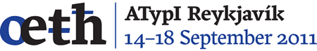
The ATypI Reykjavík logo was designed by Birna Geirfinnsdóttir, using the typeface ‘Frijky’ by Neelakash Kshetrimayum.
Conference sponsors
Gold: Microsoft
Silver: FontLab
Bronze: Adobe, Font Bureau, Monotype Imaging
T-shirts: Font Shop
Bags: Linotype
Refreshments: Google
Student: Extensis
Promotional materials: Dutch Type Library
Media partners: Typo, Design Made in Germany