Home / Type Design / Page 2

A Responsive Chinese SongTi typeface for Multiple-Use Occasions

Digital devices are gradually replacing paper, and reading on screens with various resolutions has led sans serif typefaces to replace serif typefaces. The high readability of serif typefaces is something we can’t ignore. In Chinese, MingTi /SongTi is just like serif in Latin, with greater contrast on the strokes. For serif typefaces, there are some… Continue reading A Responsive Chinese SongTi typeface for Multiple-Use Occasions
Mexican Culture Inspired Type Design. Xantolo Custom Project

The Memento Mori book is a hybrid of the video game and the interactive book, made by the Multimedia Center of the National Center for the Arts. The story reviews the novel by Pedro Páramo. Its illustrations are based on the engravings of José Guadalupe Posada, a Mexican artist who criticized society and incorporated elements… Continue reading Mexican Culture Inspired Type Design. Xantolo Custom Project

How To Design Your Country’s National Font

How do you design your country’s national font? That’s what Wayne Thompson was asked to do by Australia’s national broadcaster, the ABC, whose charter mandates the delivery of content which contributes to the national identity. They asked for a type family which unifies their digital presence across multiple platforms, is best-in-class for legibility and accessibility,… Continue reading How To Design Your Country’s National Font

Thriving as an Independent Typeface Designer in the 2020s

Typeface Design in the modern age is very much like fashion–more and more typefaces are developed every day for problem-solving or aesthetic reasons, or both. With such an abundance of material already out there, how can a driven, passionate type designer get their work noticed and lay the foundations for a thriving business whilst staying… Continue reading Thriving as an Independent Typeface Designer in the 2020s

TFC—The Development of a Digital Typeface to be Used as a Calligraphy Learning Tool

This work presents the development of the TFC Foundational Hand, a typeface to be used in the calligraphy practice. In calligraphy, the common way to study it is trying to replicate letters presented in books worksheets. This practice has been in use for centuries, but because of the paper media restrictions, there are some limitations.… Continue reading TFC—The Development of a Digital Typeface to be Used as a Calligraphy Learning Tool

Rescate de las itálicas de Griffo: Un estudio de la puesta en página de poesías / NEW SESSION!

With a focus on Francesco Griffo’s first work, this presentation shows the development of a typeface that contemplates three variables: roman, italic, and an italic with connections. With this typeface, it is possible to make a comparison between the simple italic and de-connected italic in order to understand it. The loss of connections between letters… Continue reading Rescate de las itálicas de Griffo: Un estudio de la puesta en página de poesías / NEW SESSION!

Time Travel Branding: The fictitious visual identity program of Xenia Hotels

In the early 1950s, the Greek state was effectively bankrupt. On that basis, the Greek government decided to initiate the ambitious Xenia project—a nationwide hotel construction program aimed at creating accommodation infrastructure for the development of a tourist industry to assist in rebuilding the economy. Throughout the 1960s and 1970s, the 59 Xenia hotels that… Continue reading Time Travel Branding: The fictitious visual identity program of Xenia Hotels

T]M20 Project: The adaptation of roman capitals construction to lowercase

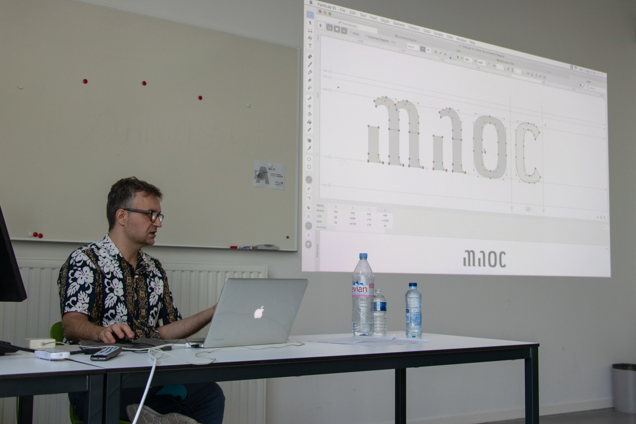
This presentation will go through the process of a TypeMedia project, and will be a reflection on the roman alphabet, and the relation between uppercase and lowercase. The Latin script is a bicameral script, and uses two alphabets for a given language. Those two alphabets originally belonged to different ways of writing from different periods… Continue reading T]M20 Project: The adaptation of roman capitals construction to lowercase

Q&A Session: Contributing to the Commons: What, Why, and How?

In the last 20 years, the number of new typefaces has grown exponentially, especially in writing systems with less activity in the twentieth century. One current in this torrent of cultural expression are the contributions of typefaces to the commons; from both student-hobbyists and the world’s largest tech companies, using licenses like the SIL Open… Continue reading Q&A Session: Contributing to the Commons: What, Why, and How?